A modern business rebrand that respectfully carries the past into their future.
Chin Communications
Sector
Communication
Project Scope
Art Direction
Brand Guidelines
Brand Strategy
Branding & Identity
Digital
Print
Signage & Wayfinding
Worked with
Progress Signs
Tigercorp
Inkifingus
Impact Digital
For more than two decades, Chin Communications has provided Chinese translation services to people and businesses across Australia.
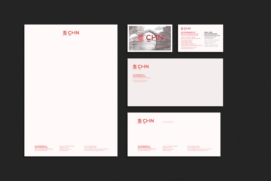
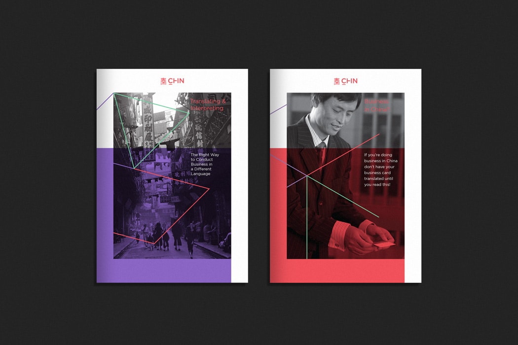
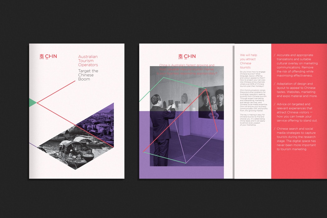
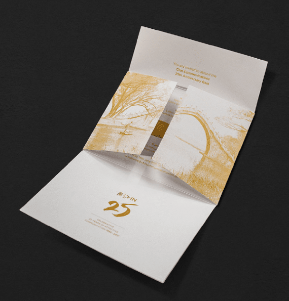
Seeking a modern take on a well-recognised brand, Chin Communications approached Design by Bird for a modern business rebrand. Driven by research, we considered which elements of their past could be brought into their future.
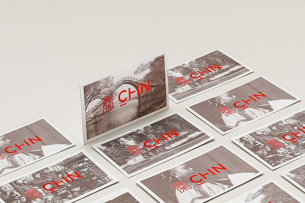
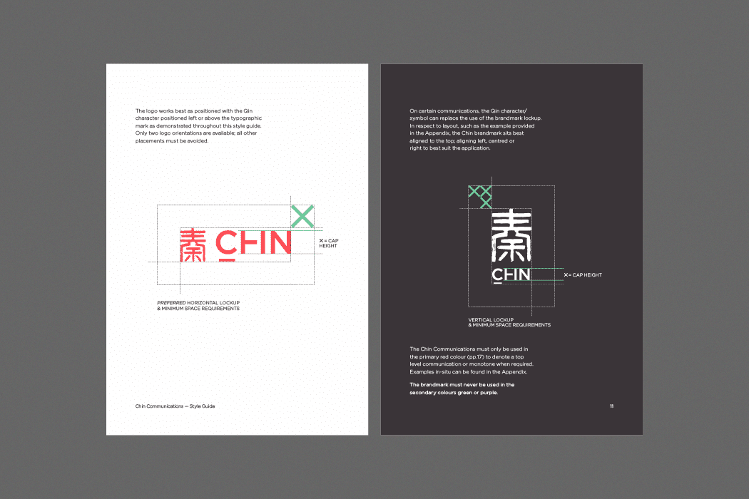
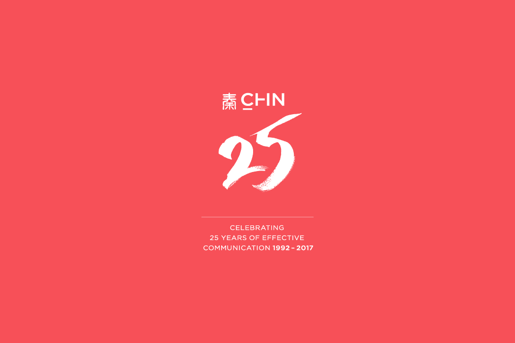
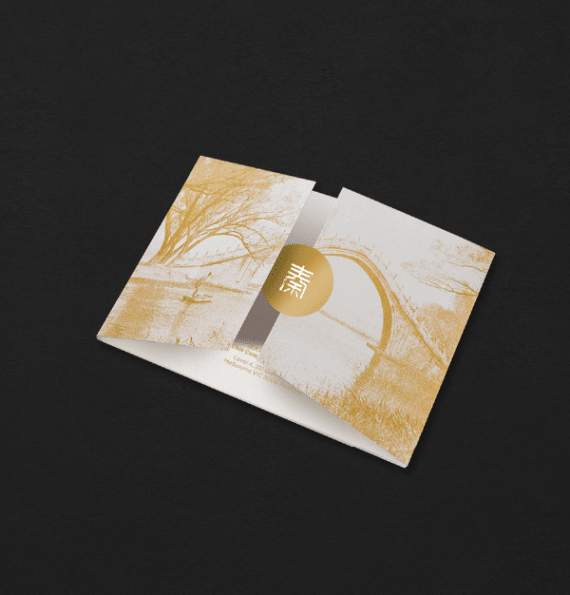
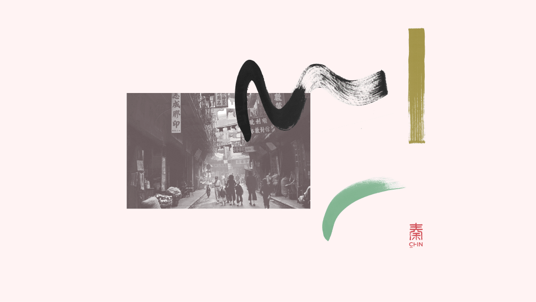
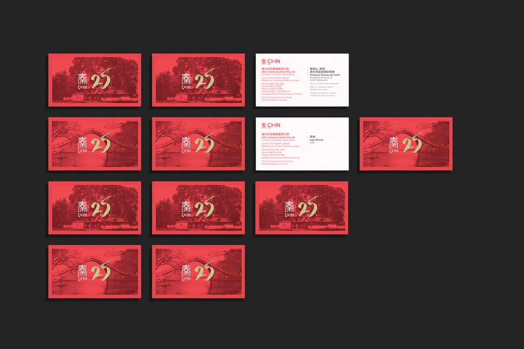
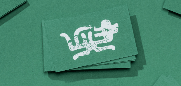
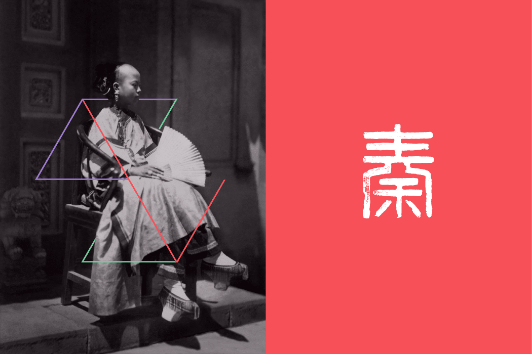
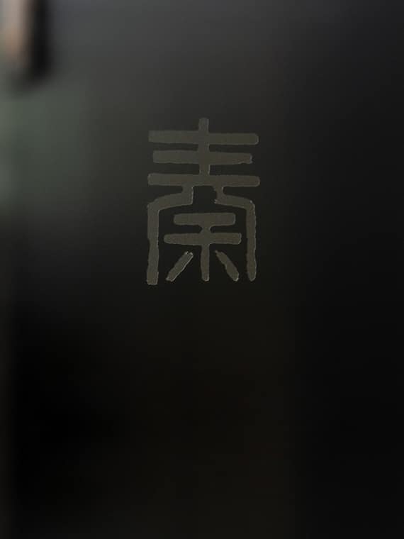
The inspiration for the logo was simple yet profound. When Emperor Qin standardised currency, each coin was inscribed with seal script – an ancient Chinese technique. With this style in mind, the logo was re-worked, a stamp made to celebrate the authenticity reflective of the hand tools and craft of the time, complemented with modern typography.
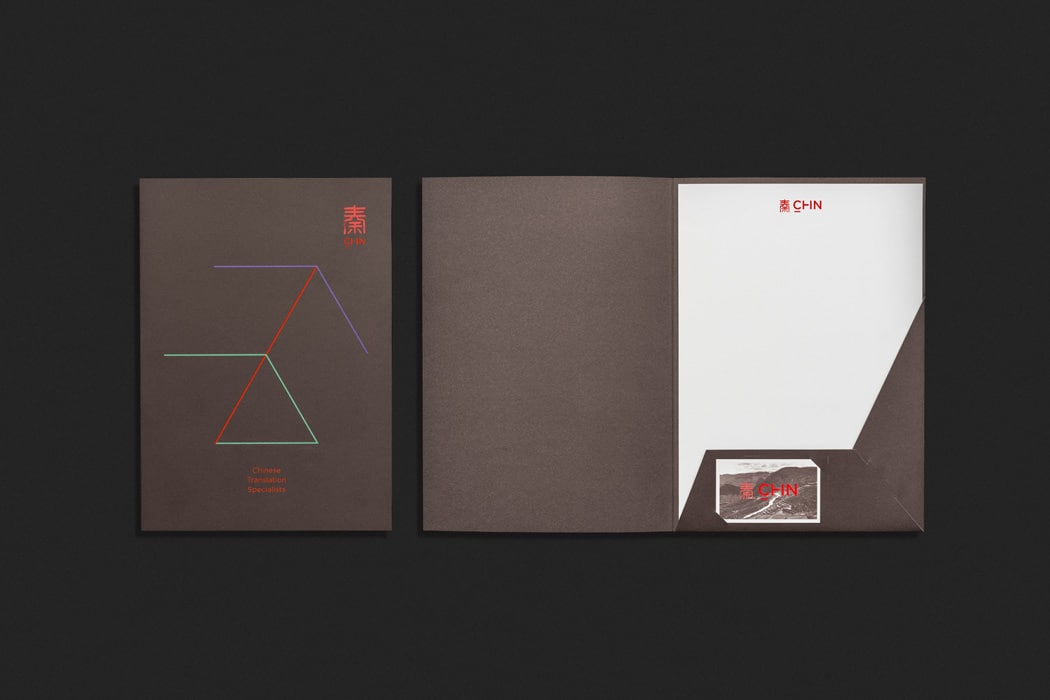
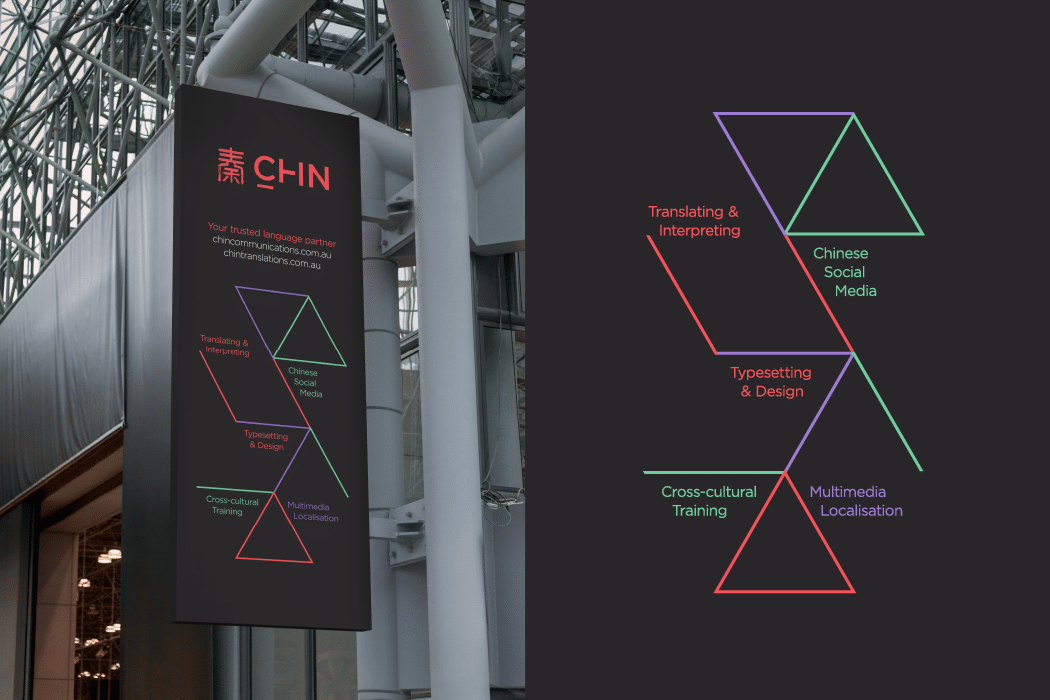
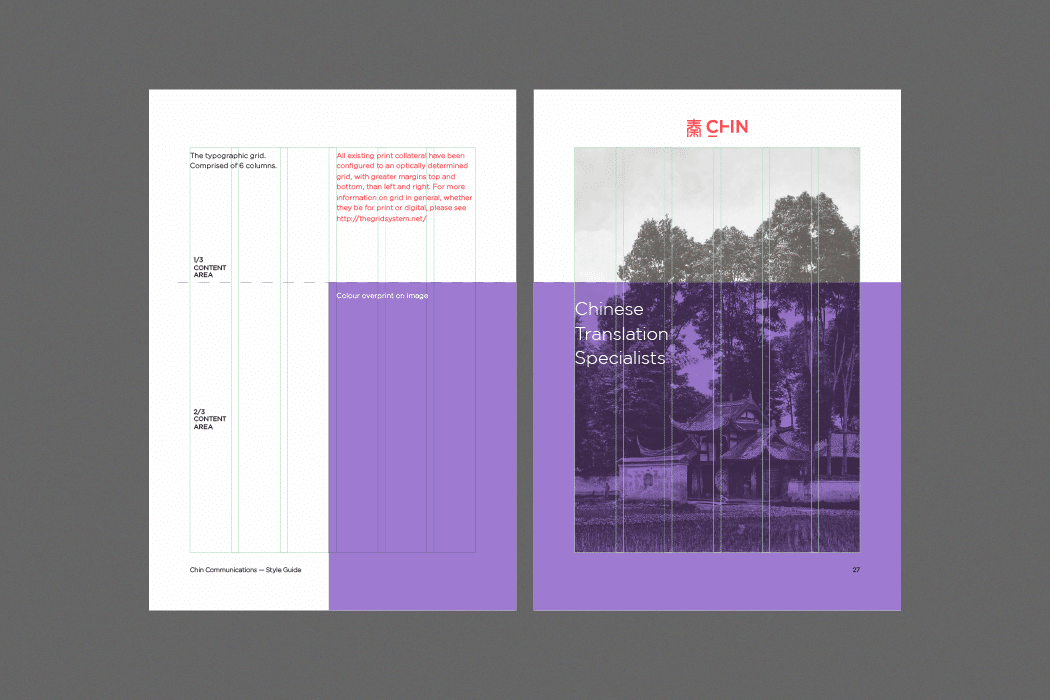
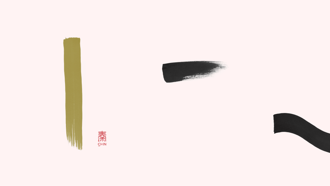
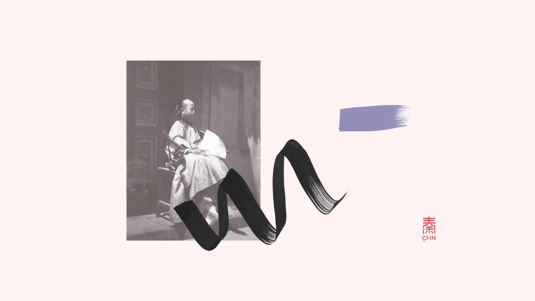
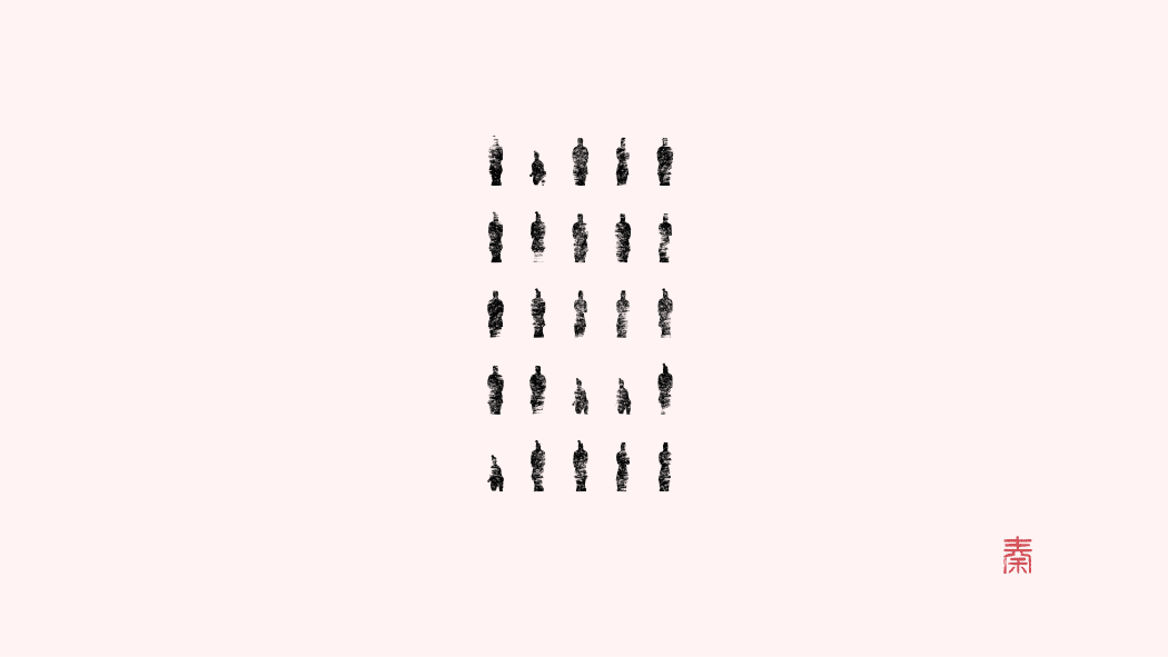
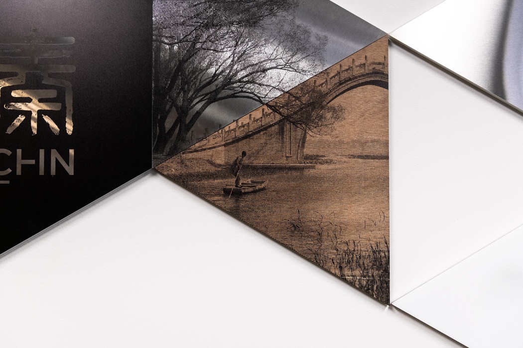
The inspiration for the colour palette arose similarly. Their primary red became a brighter, more modern tone while taking the secondary and tertiary colours came from the ancient Terracotta Warriors. A palette was created that, together, harmonise tradition, innovation and strength. By depicting shape as communication, Design by Bird were able to represent the numerous and changing interpretations of language – a concept so integral to global translation.
Chin Communications rebrand — Finalist Create Awards – Identity category


"It has been a long and fruitful partnership for over a decade where Design by Bird understands the history and mission of Chin, knows all the team and that is a great advantage when new briefs arise that they get it right away."Kate Ritchie, CEO

